Shot Scope
PDP Design for the best-selling V5 GPS watch
Responsibilities
UX/UI Design, Marketing
Timeline
2 Months
Platform
Web
Introduction
Status quo
Shot Scope is one of the fastest growing brands in golf, offering GPS watches, laser rangefinders, and performance tracking products. As part of the 2024 launch of the V5 GPS watch, I led the UX/UI design for the product details page (PDP), optimising the purchasing experience to maximise conversions.
About the project
A key part of the website is the PDPs, as they drive direct revenue to the business. Optimising PDPs to ensure the purchase flow is seamless, products and features are communicated clearly, and the experience is strong on all devices, is an important objective for the team.
I was the sole UX/UI designer on the project. I worked with an Ecommerce manager and web developer.

maximise sales & increase conversion
HMW:
create a seamless experience on all devices
HMW:
present USPs clearly to users & convince them to buy
HMW:
Process
Teardown analysis
I conducted a teardown analysis of the PRO L2 PDP to identify areas we could improve.
PDP & competitor research
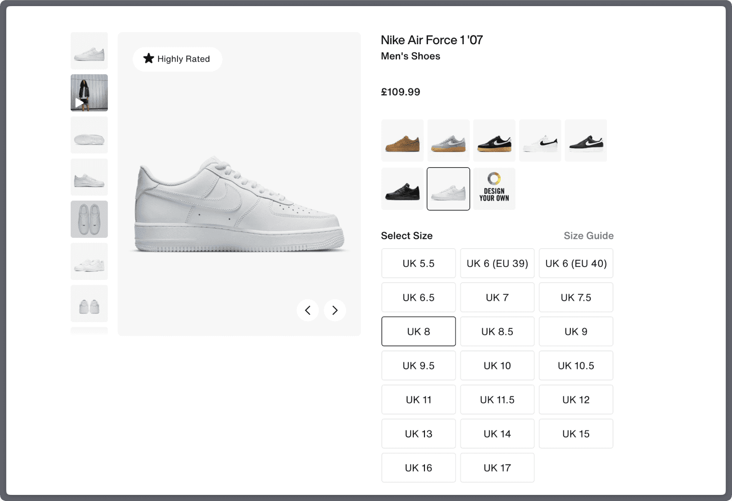
I researched PDPs, and direct/indirect competitors. Keeping the page structure and content similar to what users currently see and interact with, ensures an interface that’s easier to use. Nike utilise a very minimal aesthetic on the buy section of their website ensuring the product is centre stage. The social proof badge on the product gallery, followed by purchasing USPs like free delivery and returns is very effective.
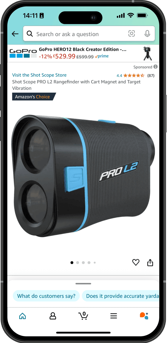
Amazon also use a social proof badge on their PDP, and also display a product star rating. These elements are essential for distilling trust to the consumer.
Click & heat maps
I generated click and heat maps for our current PDPs using HotJar to find out where users were interacting with our current pages the most.
Marketing & email campaign
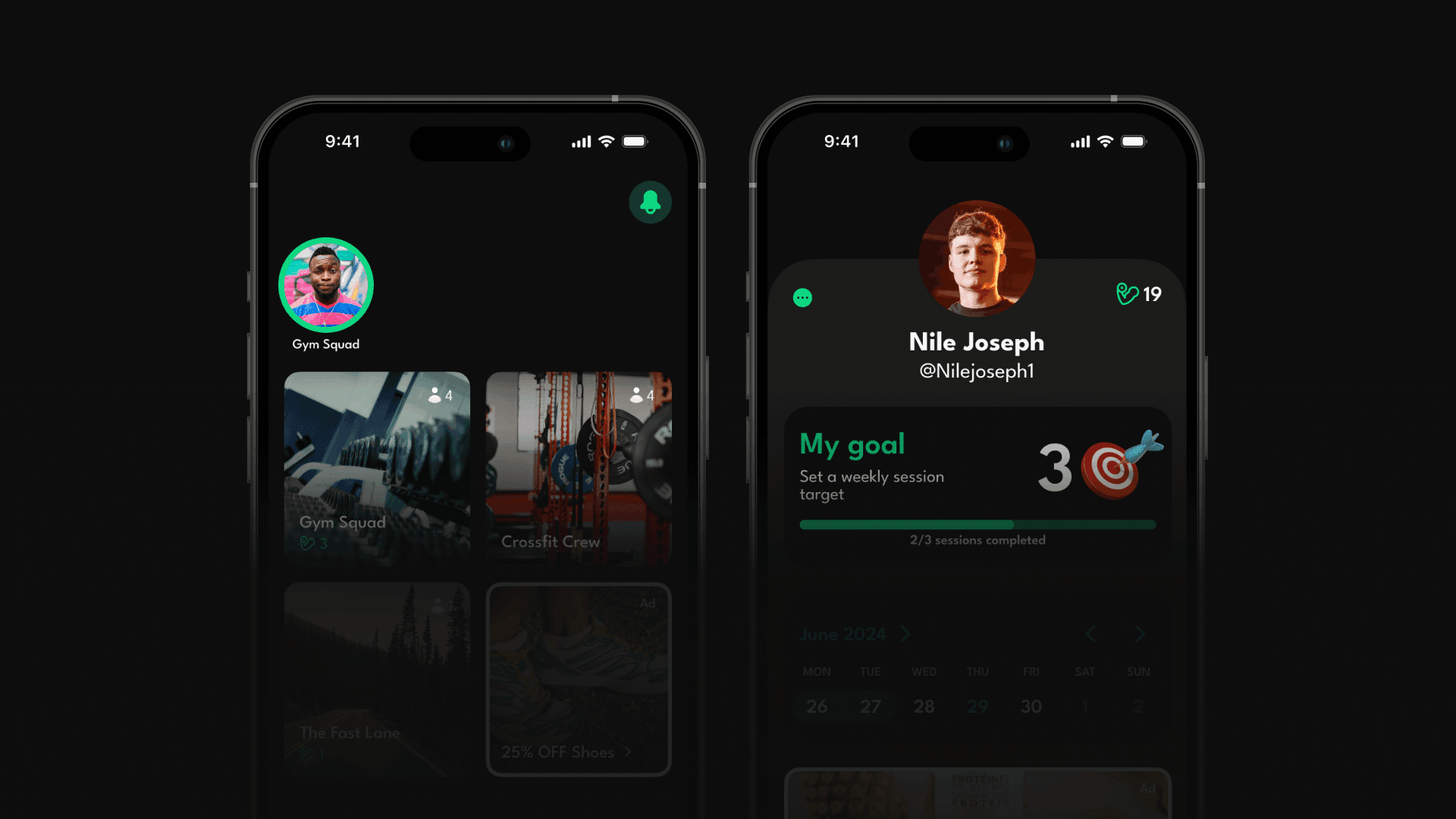
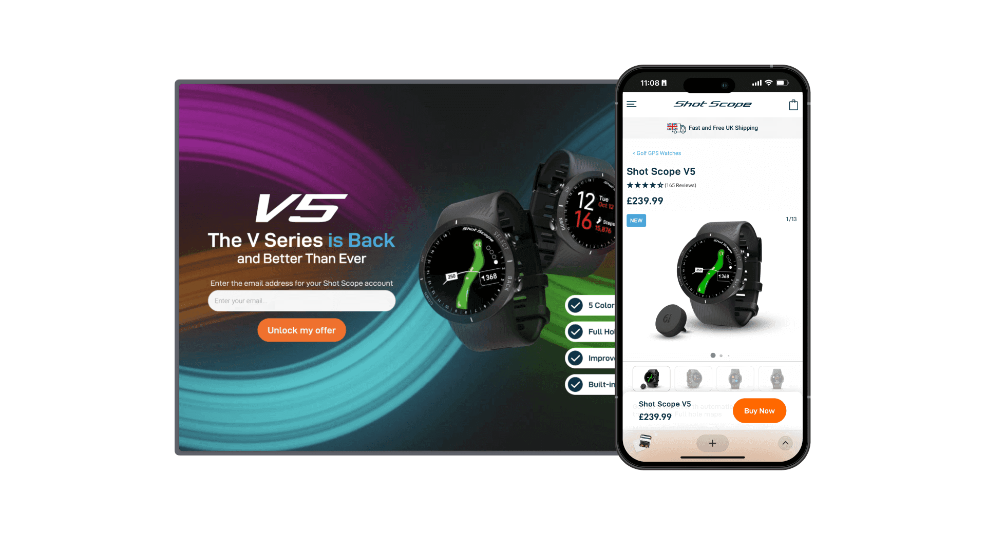
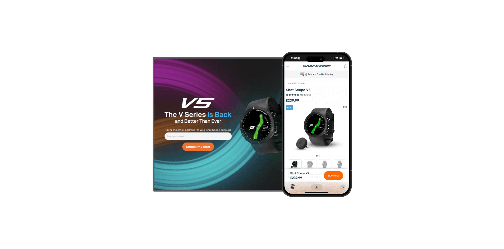
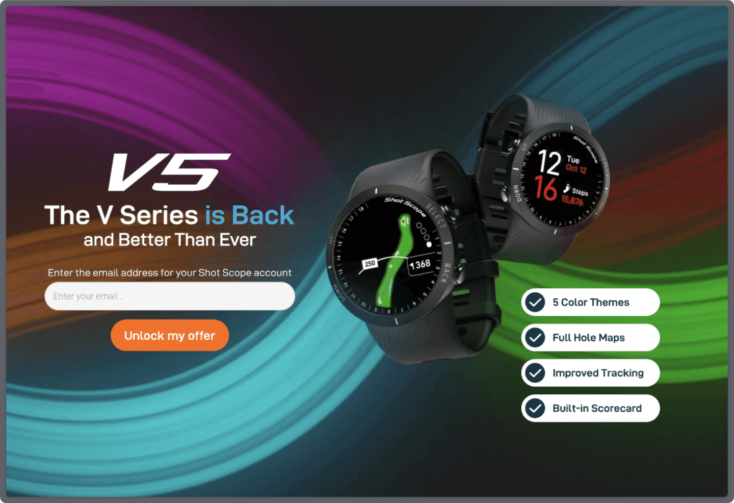
I created the initial coloured paint stroke design that was used across the marketing campaign, and collaborated with the marketing team to create social and email assets.
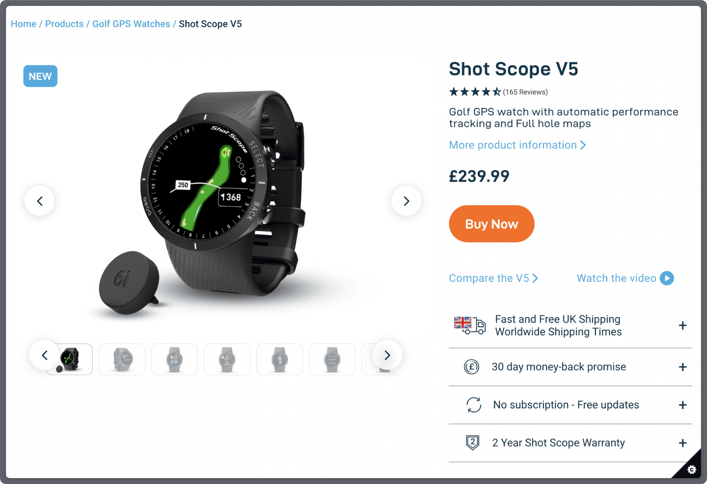
Final designs
Buy section
The enlarged product gallery on desktop is responsive to screen size which allows the product to be more prominent. On mobile, the product name, price and reviews rating were moved above the fold, as well as the buy CTA, to ensure the most important elements were visible from the start. Text links allow users to access key information faster (more info, product video & comparison).
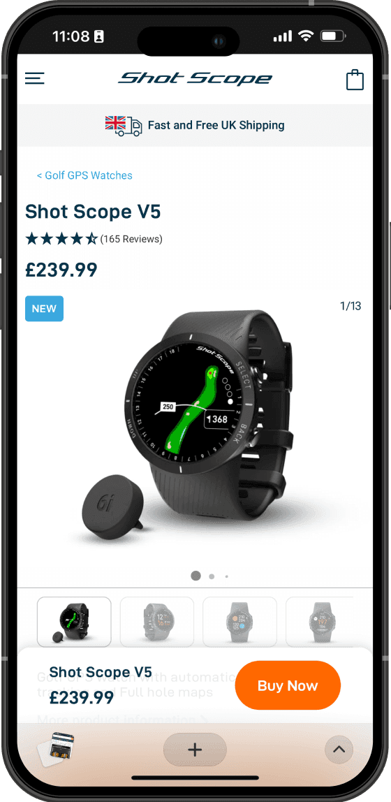
Floating action button (FAB)
The FAB allows users to add products to the basket no matter where they are on the page. This saves users time, and keeps the primary action prominent. On desktop, the FAB recorded 74% more clicks than the static buy button, and on mobile the FAB accounted for 4.13% of all page taps, according to HotJar analytics.
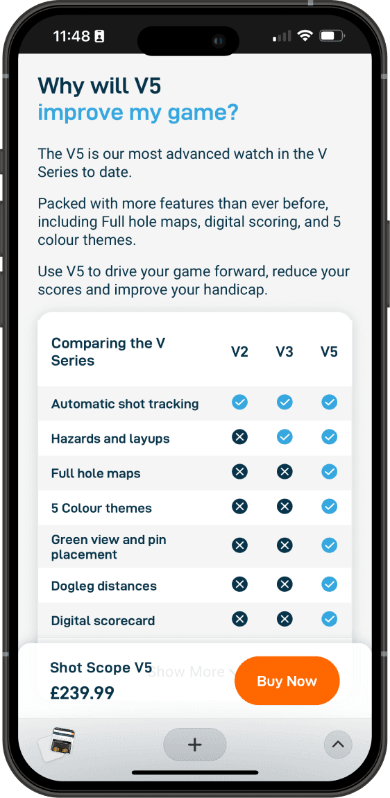
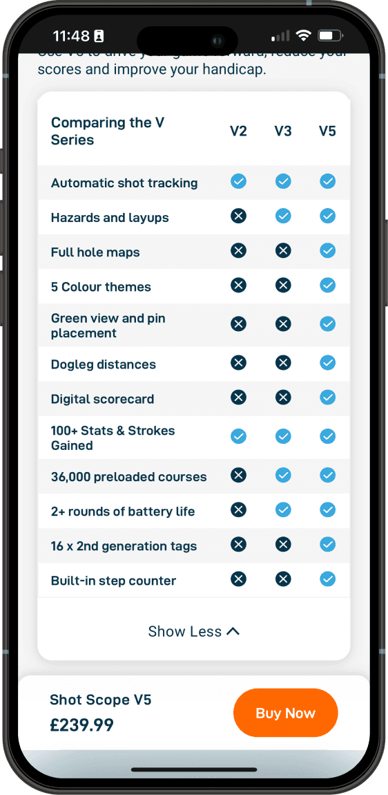
Comparison table
The comparison table has less products to make the information easier to consume. The leftmost column is fixed on mobile to allow users on smaller screens to horizontally scroll whilst keeping features in view. Interaction on the mobile comparison table is high, with 10.92% of all page taps coming on the ‘show more’ button.
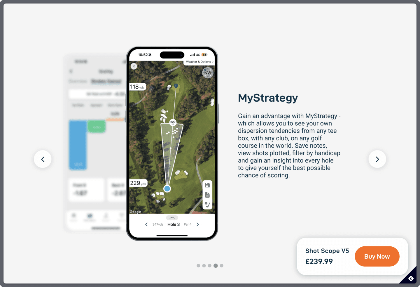
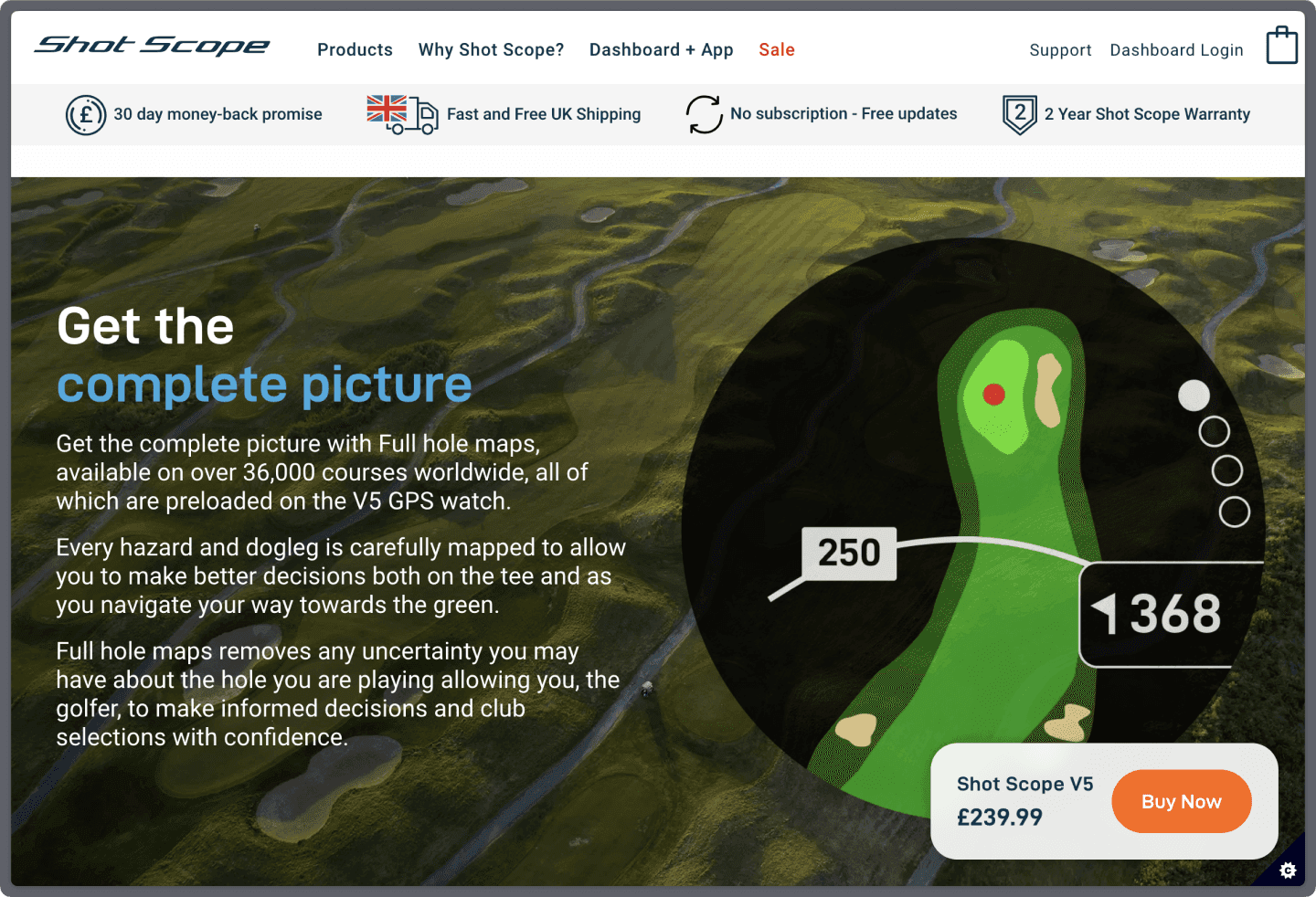
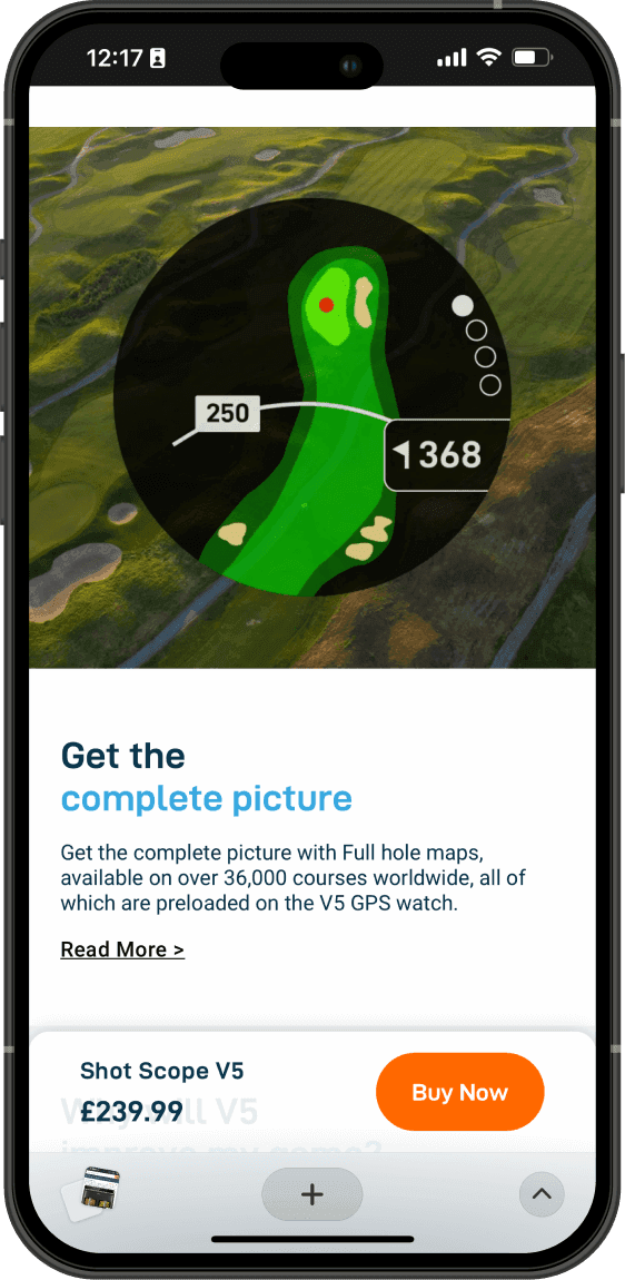
Making more of the USPs
To call out key USPs, I implemented a full viewport image and text block on desktop. This helped visualise new features such as GPS watch maps, utilising strong photography and product imagery. To achieve optimisation on mobile screens, the content is vertically stacked.
Impact
The PDP was designed, developed and launched in 7 different regions. The PDP recorded strong sales numbers on the website on the month of launch and beyond, becoming the best-selling product.
I planned out a user testing study to assess whether or not we achieved the goals we set out to, however it has not been carried out yet due to other important projects for the business. I look forward to validating the page build in the future.